Here’s our straightforward answer to the question “what is responsive web design?”
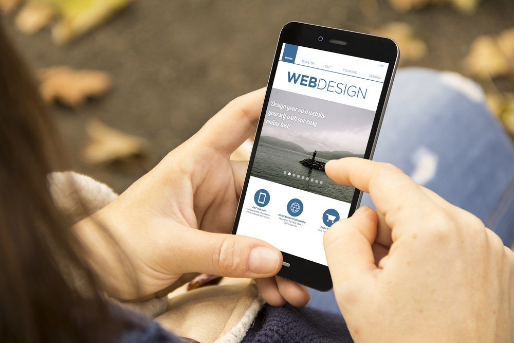
“A website with responsive design works with any device a user has.”
Responsive design aims to satisfy all devices. WordPress is particularly helpful with this: virtually all its approved themes are mobile-ready, so there’s no need to create specific mobile sites. There are also tons of mobile-first WordPress themes designed specifically for smartphones. They’ll work on other devices, but their assumption is that the majority of visitors use smartphones. Some designers believe all websites should have a mobile-first approach.
However, about three out of four U.S. adults own a laptop or desktop, even if it’s not their go-to tool. The responsive design respects the big screen, but unlike in the earlier days of the web, it doesn’t assume it’s the primary way people use the Internet.
That said, here are three items you need to know and understand about responsive web design elements for your site.
Responsive Design Aims For Smart and Easy Website Navigation
What good is a website if it’s difficult to navigate? Take a look at your analytics to see what devices people use on your site.
Most mobile users find scrolling down a single page is a lot easier than clicking on tabs and buttons to move from page to page. “Infinite scrolling,” in which there’s no end to a page, works well for browsing social media, sharing information, or leaving a reaction (smiley/frowning face, thumbs up/down, etc.). Keep in mind that this means users aren’t leaving behind breadcrumbs, and it may be more difficult for them to locate specific information or return to it.
Pagination is better for sites that have a definite goal like making a purchase or completing a form. It lets users bookmark pages or reverse back to earlier ones they visited. If your site is page-based and has a lot of mobile users, be sure you have large buttons that allow for easy mobile navigation between pages and that menus appear at the top. The beauty of this is that it will still look OK on a desktop/laptop.
White Space is Your Friend
More people visit the web on a small mobile screen, which can make it difficult for content to stand out. A crowded look is a huge turnoff, even on a bigger monitor or laptop screens, and a good way to send people back to the search engine!
Make sure your most important content is set aside with white space. One way to balance of white space and content is to write in easy-to-read chunks of content. This makes it easy to skim, which is what most people are doing anyway. Plus, Google prefers more content than less, so it’s essential to embrace white space.
Keep a Consistent Look on Each Page
People visit a lot of websites. Make sure your look, or brand, is recognizable to repeat visitors. Standardize your page layouts as much as possible, particularly the interior, content-driven pages. It’s OK to let certain pages stand out like your homepage, landing pages created for special campaigns, and the call to action pages.
Key information like the business and website name should appear in headers or footers on each page. If you have a logo, be sure it appears in the header, and as a site identity icon (favicon) that shows up on URLs.
Responsive design can be further improved with user experience design or UX. UX examines how visitors use the site and takes steps to make visits even more inviting and enjoyable.
Find Out More
Check out this blog to find out how responsive design compares to adaptive design. And this post if you want to dig in deeper to find out how responsive design changed the world.
Oh, and if you’re looking for help with your website’s development and management, check out our services to see how we can take the stress out of managing your site!