Building a WordPress website is easy. The content management system (CMS) comes pre-built with features and functionality that can be used to get started without spending a dime. Follow the steps in this post to learn more about the thinking process behind building a WordPress website and to get started with the WordPress block editor.
Here’s what you’ll find below:
In this article |
|---|
| Website Planning Checklist |
| Build Your Website With The WordPress Full Site Editor |
| Wrapping up |
Dale Carnegie once said, “An hour of planning can save you ten hours of doing.” So, before you start building your WordPress website, open up a new text file or grab a pen and a piece of paper and make some notes.
Also see: SunnyHQ’s Affordable Small Business Website Design
Website Planning Checklist
The website planning checklist below will help you prepare everything you’ll need to start building your WordPress website. Use it as a reference to make important decisions.
1. Define your site’s purpose
It’s easy to underestimate the importance of a clear and simple purpose statement, but what you note down here will likely affect the layout of your website, which pages you’ll need, and which plugins you install.
 For example, if the purpose of your website is to “Sell stock photographs”, you’ll likely need a shop and / or gallery page, a single product page, shopping cart functionality, and a checkout page – in addition to the standard home, about, and contact pages.
A brochure website, on the other hand, is a static website with few dynamic elements. It is typically used by businesses that simply want the website equivalent of a business card. Here the standard set of pages apply: home, about, services / products, and contact.
Blogs are even more straightforward, requiring a home or front page that lists your latest posts, an about page where you introduce yourself, and perhaps a contact page. Category pages (e.g. “Italian”, “Chinese”, “English”, and “French” for a foodie website) are dynamically generated by WordPress.
2. Research your target audience
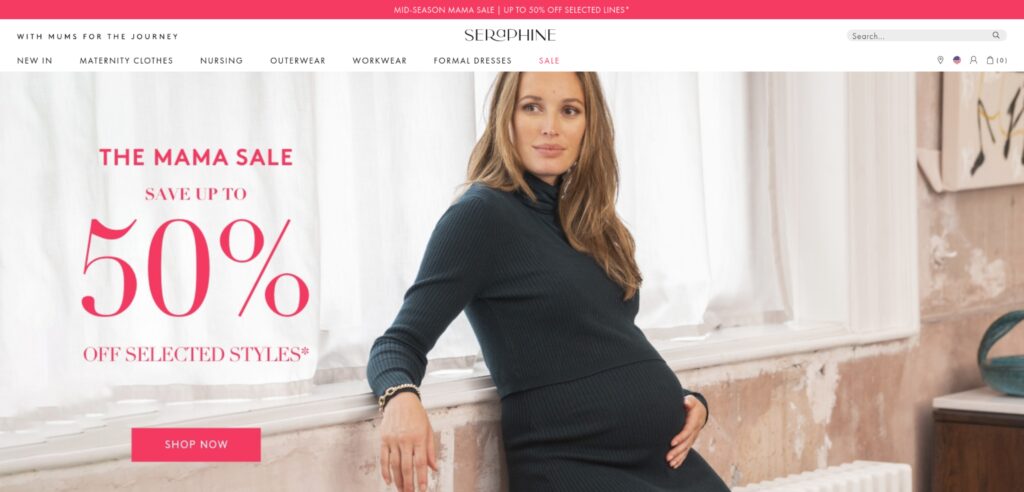
A target audience is the group of people you are targeting with your marketing and advertising – it’s who you think is most likely to buy your products or services. John Deere’s audience consists of people (mostly men) in the farming, construction, engineering, and agricultural sectors because they’re more likely to need John Deere’s products and services. Likewise, Seraphine is a clothing brand that targets pregnant women and those already nursing with its marketing.

The audience definition of each of these brands – and so many others – informs virtually every aspect of their website – from colors and fonts right down to the page layout, images, and copy. Now those companies may have bigger marketing resources than you do, but audience research, especially if you’re building your first (or second, or third…) WordPress website doesn’t have to be rocket science. Find out:
- What questions are people asking about your product, services, or area of specialty?
- Who are the people asking these questions?
Both John Deere and Seraphine’s websites are built to cater to their audiences. It’s important to get into the mindset that you’re designing and building your WordPress website for other people, not for yourself.
For more information about gaining insight into your target audience, have a look at Marketing Evolution’s Steps to Find Your Target Audience. Entrepreneur’s 10 Ways To Learn About Your Target Audience also lights on some good strategies to help identify your target audience.
Need help choosing your website colors? Use these resources:
The 21 Best Website Color Schemes to Inspire You – Hubspot
Color Palette Generator (from a photo) – Canva
Color Palette Generator – Adobe
3. Plan your pages, get images, and write your content
To be launch-ready, you need a minimum viable product. The “product” is your website. To have a minimum viable product, you need to have the necessary pages to start doing business, such as:
- Home (the front page of your website)
- A page about you or your business (usually ‘About Us’)
- A page that showcases your products or services (usually ‘Products’ or ‘Services’)
- And finally, a page people can use to contact you (‘Contact Us’)
- Optional, but recommended, is a page for your blog posts (‘Blog’ or ‘News’ or ‘Insights’, etc.)
These pages also support the typical user journey through a website: A visitor finds your product or service page through Google or social media. If they like what you have to offer, they might check out your about page to learn more about you and decide whether or not you are trustworthy. When all check out, they’ll add a product to their cart or head over to your contact page.
But, for all that to happen you’ll need copy (text) and images for each of these pages.
Copywriting
You don’t need to be a great copywriter to write good website copy. Nor is it a requirement to be a great salesman, especially if you’re just getting started with your website. Often, the only requirement is to present the reader with enough information to make an informed decision.
Find out how to do that with any one of the many free courses on the internet. Here are a few recommendations to get you started:
The Ultimate Guide to Website Copywriting – Coach Carmine Mastropierro
The Fundamentals of Copywriting [Free 5 Hour Course]
How to Write Website Copy When You Suck at Writing
Images
The upside of website images is that you don’t need any artsy talent or prowess with Photoshop. The downside is that without any talent or Photoshop superpowers, you might need a subscription to one of the commercial stock image retailers.
Before you sign up, consider what you’re going to be talking about on each of the pages you want to publish, and then decide which images will go best with that page. Use the search function on the sites below to see which sites have the stock images you need.
| Free | Paid |
| Unsplash | Adobe Stock |
| Pexels | Shutterstock |
| Gratisography | iStockphoto |
| Pixabay | Dreamstime |
| picjumbo | Envato Elements |
| Life of Pix | |
| Burst |
Additional resources
If the objective is to grow your website over time, it’s necessary to familiarize yourself with terms like information architecture and content strategy, both of which are critical to your website.
Information architecture refers to how information is organized on your website. A website with a well-planned information architecture will be easy to navigate and use. Learn more about information architecture on usability.gov.
A content strategy guides the creation and curation of content on a website. Even small starter websites can benefit from a content strategy to ensure that there’s always a fresh supply of material that promotes products or services to humans and search engines alike. Learn more about content strategy at the Nielsen Norman Group.
4. Find a managed WordPress host for your website

It might sound a little self-serving to say you should find a managed WordPress host given that that’s what we do, but here’s the logic behind it:
- It’s enterprise hosting without all the tech stuff – just focus on your website and everything else is taken care of
- It’s built to run WordPress blazing fast
- It’s super secure and protected against hackers (and will always include SSL)
- You’ve got reliable support backing you every step of the way
The last one, support, is especially important. Bad support can leave you hanging at times when you really need help. While that might sound like a cliché, it is (unfortunately) not an uncommon situation. Good support, on the other hand, is like having your own tech team, and not just for tech stuff, but for general WordPress / eCommerce advice, too.
5. Use a dev site
Given that this is your foray into WordPress website building, there are three types of sites you should be aware of:
- A production website or live site is a site that can be found and used by visitors on the internet
- A staging site is a copy of your production site that cannot be accessed by the general public and is generally used to test updates and site functionality / design changes before making those changes to your live site
- A ‘dev’ or development site is a website you’re using to try things out, play with different designs, and so on. It can be run from your host’s server, or from your local computer.
If you’re new to building WordPress websites, it’s highly recommended to set up a dev site on your local computer. Or, if it’s included in your plan, ask your hosting provider to create one on their servers. This will give you the freedom to play around and make mistakes without affecting your business or bottom line. Make notes as you go along so that you can apply what you’ve learned when building your production site.
6. Study the ‘Golden Rules’
Unless you’re new to the internet, you’ll know that lists are a big part of everyday online life. Whatever you’re looking for, there’s probably a list for it: “The 7 Best Sushi Restaurants in…”, “10 Ways To Wash Your Dog Without Getting Wet”, and so on.
The same is true for website design; many lists of “Rules of Website Design” can be found on the internet. But, rather than use them as rules, we suggest studying them in the context of guidelines and perhaps polite recommendations to inform your endeavors rather than dictate them.
Below are some of these rules – click the link to visit the source and learn more about each one:
Golden Rules to Website Design by Maya Simmons
- Create a Visual Hierarchy
- Use the Golden Ratio
- Avoid Possibility Paralysis
- Bigger Is (Often) Better
- Consider Gestalt Principles
- Utilize Negative Space
- Acknowledge the F-pattern Rule
- Consistency is Key
5 Golden Rules For Web Designing by Octa Logo
- Customer Demographics
- Useful Content
- Call to Action
- Study Your Competitors
- Check and Balance
5 golden rules of ethical web design (& how to apply them) by Renee Fleck
- Focus on the message
- Keep your layout neat
- Choose user-friendly fonts
- Avoid animation hell
- Make it easy to navigate
With the essential theory done, we can move on to the practical side of building your WordPress website.
Build Your Website With The WordPress Full-Site Editor
The WordPress full-site editor makes it easy to design an engaging and informative website. It’s versatile enough to design almost every basic feature needed to be launch-ready without ever touching commercial themes, page builders, or code. Learn to use the WordPress full-site editor to build your website, and you’ll be able to work with most free and commercial website builders.
The steps below will show you how to customize the header using the WordPress full-site editor. But it’s not about the header specifically – these steps can be replicated to design other elements of your website.
It’s important to keep in mind that the default WordPress theme – Twenty Twenty-Three – is used in the example below. You’re welcome to use a theme of your choosing but keep in mind that only block themes can be edited using WordPress’s full-site editor. Click here for a list of block themes in the WordPress theme repository.
Let’s get started:
Navigate to Appearance > Editor from the WordPress dashboard.

The header and footer are classified as template parts. Template parts are blocks or containers that are used to display other blocks, and typically won’t need to be changed often.
Select Patterns in the block editor menu to load the Patterns library. The Header and Footer are located under ‘Template Parts’.

Let’s get started with the header where we’ll add our site logo and navigation. Click on Header, and then select Header from the list in the right-hand pane.

Click the pencil icon to start editing the header.

Before you start making changes, let’s take a step back to decide what should be placed in the header. A logo is a necessary part of branding (and just general site identification), so that’ll be included. Navigation is the other must-have, even if your ultimate goal is to create a one-page website.
Whether you’re a seasoned designer or a beginner, activating the List View pane can simplify the entire design process. Here you’ll find a hierarchical list of all elements contained within the page or, in this case, the template part you are busy editing. One of the most useful features of the list view is that it makes selecting individual items a little easier.

In the image above you can see that our entire menu consists of:
- A Group
- A Row, which contains individual blocks – Site Title and Navigation in this case
In other words, we can use Groups to group rows together, and we can use rows to group individual blocks together. Understanding this concept becomes important when, for example, you want to include sections for different types of content on one page, each with its own style.
Below we’ll see how this can be applied to our header. For now, however, let’s remove the site title and add a logo instead.
Adding a logo to your WordPress website
Hover your mouse over Site Title in List View and click on the three dots that appear. Then click Delete. Alternatively, click on Site Title in List View and press Shift + Alt + Z.
![]()
Next, click on the blue + icon to add a block. Use the top search bar to search for ‘logo’. Then drag the Site Logo block to your header. If your site logo ends up on the right rather than the left, you can drag individual items to where they should be either in the editor or in the List View pane.
Upload your site logo within the block editor by clicking on the blue upload icon

But we can take it even further. What if we wanted a top bar above the header where we can display social media links, business hours, and a phone number?
Here’s where our comprehension of groups and rows comes in handy. We’ll either need a new group or a new row for all the individual blocks we wish to include in the bar above the header. If we choose a row, it will be subject to the padding of the group. Padding is the space between the content and the border of an element. This means that if we change the background color of the row, the background color of the group will still be visible around it.

However, if we create a new group, we can give the entire group a background color which will run the entire width of the header. The choice is yours, but for the sake of this tutorial, we’re going to create a new group.
 Adding a top navigation bar
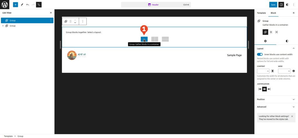
Click on the blue + icon and search for ‘Group’. Click on the Group icon in the results, or drag it to your header. In the image below, the newly added Group is below our main navigation group. Click and drag it upward in List View to position it above the main navigation group.
Inside the newly added group are three icons that provide a choice for a starting layout:
- The clear rectangle icon indicates a group without a row. Here we’ll need to manually add a row, in which case it becomes equal to the rectangle divided vertically.
- The rectangle divided vertically indicates that rows or blocks added to the group will be placed next to each other. However, in the settings pane on the right we can change the orientation of the block by clicking the down arrow, in which case it becomes equal to the rectangle divided horizontally.
- The rectangle divided horizontally indicates that rows or blocks will be stacked on top of each other. It comes with a default row which, if deleted, makes this group equal to the clear rectangle.
For the purpose of this tutorial, let’s choose the clear rectangle.
 Next, with our newly created group highlighted in List View, click on the blue + icon and search for ‘row’. Drag the row icon to the empty group to add the row to our group.
Easy, right? But you’ll notice that the row is shorter than the group, which means that any blocks we add to the group won’t be aligned left and right with our logo and main navigation. Alignment isn’t a requirement, but it makes things look a little neater.
So, to stretch our row out, click on the Row in List View, and then click the align icon in the panel above the row. Select Full width from the drop-down menu.

Before we add content to our top navigation bar, let’s adjust the style of the group. You can adjust the style of any element by selecting it in List View, and then selecting Styles in the Settings pane.
In the Color section, we can click on Text and Background to adjust the color of each respectively. Feel free to choose colors of your choice. For this tutorial, we’ll make the text white and the background color black.

Now click on Row in List View, and click on the blue + icon to start adding blocks to your row. I’ll be adding Social Icons, and two Paragraph blocks for business hours and a telephone number respectively. (Note: If your blocks are stacking on top of each other despite your row having a horizontal orientation, chances are they are not in your row. You’ll need to drag them into the row.)

In the image above you can see the three blocks added to the top navigation bar, and you’ll note they’re left-aligned, with a big gap to the right. It would look a little better if we spaced them out evenly. In List View, click on the Row and then click on the Justify icon. Select Space between items.
Here’s the completed top bar:

Remember, the purpose of editing the header and adding a top bar is to get started with the full-site editor. Use the same steps to edit other parts of your website.
Wrapping Up
Planning is an essential component of building your WordPress website. It starts with defining your site’s purpose and determining who you’ll be building your website for. Armed with this knowledge, you should be able to map out the pages you’ll need and also decide on the colors you’ll use.
Next up, it’s time to plan page layouts and create your content. Since this is likely one of your first WordPress websites, it’s recommended that you get started on a development website on your local computer or one created by your hosting service provider. Finally, start building your website.
Ready to go live, or do you need a development site backed by awesome support? We don’t just offer WordPress hosting, we make your life a little easier with A-grade support that can help simplify your journey to a successful online presence.