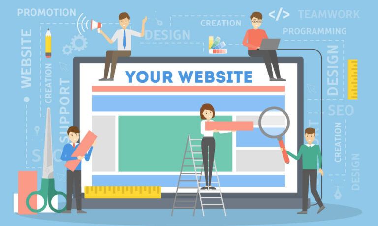
An online presence is crucial for every business that wants to engage with consumers and get them interested in your product. Having a website is arguably the most important part of that presence, as it provides potential customers with a straightforward and comprehensive introduction to you and your services. One of the most powerful elements of a website is the landing page—a succinct display that aims to turn visitors into leads.
To create the most effective landing page (and website overall), you need to have a basic grasp of behavioral design. Behavioral design involves working out why people behave the way they do, and how to use design to influence it. It forms a massive part of successful marketing.
So What is a Landing Page?
In short, a landing page is a page on your website created for a specific marketing purpose. A landing page is all about first impressions and prompting a specific call to action (CTA). The landing page’s purpose might be to prompt users to sign up for a newsletter, download a free eBook or short course, sign up for a service or enter a competition.
The goal, though, is always to make contact with potential clients and engage them enough to turn their visit into a lead. A landing page aims to secure a visitor’s details (email, phone number, etc.) so that they become marketable targets that you can persuade to purchase your products or services.
Two Types of Landing Pages
There are two broad categories based on their purpose:
- Lead generation landing pages: also known as “lead gen” or “lead capture” pages are structured as a CTA and get a user’s data, such as contact details.
- Click-through landing pages: structured with immediate sales or subscriptions in mind. With these pages, a CTA button takes the visitor through a transaction.
When you’re working with WordPress, there are many online tools and plugins that can help you create your perfect landing page. We’ve put together a list of 7 design principles that you can use to assist you.
Principles to Guide Your Landing Pages
1) Keep Things Simple
It’s no secret that clean, neat design appeals to people. If you need proof, a Google study revealed that web users prefer simple designs over complex ones.
Another finding was that website visitors form a judgment about its aesthetics within one-fiftieth to one-twentieth of a second. That’s a very short time period that goes to waste if there’s too much clutter distracting from your message.
2) Use the f-pattern
The f-pattern refers to the eye movement of visitors when they first land on a page. They often scan a page from the top left corner down and spend less time looking at the right side of the screen.
Knowing that your landing page’s purpose is to convert visitors into leads, it’s crucial to catch potential customers’ eyes as fast as possible. The speed at which they judge a page’s appeal means that the most important content should be at the top left corner—the spot where they look first.
3) Don’t Use Too Many CTAs or Links
Remember, a landing page should only have one goal. So keeping your landing page simple means limiting the number of CTAs and links on it. You have such a small time frame to engage visitors that trying to get them to do too much is ineffective.
Use as few CTAs as possible, as multiple ones can be confusing and overwhelming. Multiple prompts can also result in visitors losing trust as they perceive it as pushing too hard for the sale.
4) Stay Above the Fold
Staying above the fold is linked to principles such as keeping your landing page simple and using the f-pattern to maximize its efficacy. The term “the fold” originally referred to the part of a newspaper that you can see without unfolding it, i.e., the top half of the front page. Its meaning in web design is very similar: the fold is the part of a page visible to users without scrolling down.
There is some debate about whether it’s best to place CTA buttons above the fold. But it is generally advisable to aim for captivating content and graphics above the fold. Working with this structure means more users scroll down, anyway.
5) Design With the User in Mind
This seems like it should be common sense but is too important to omit. Designing a landing page based on your own preferences might sound like a good idea. The problem, however, is that you’re failing to speak to users.
Different users have different likes and dislikes, and catering to them more effectively requires market research. Web design goes hand-in-hand with research. These days there is also more awareness of accessibility: being more in tune with users whose sensory processing needs are often overlooked (deaf users, for example, or those with sensory processing disorder).
6) Focus on Trust to Convert Visits Into Leads
Many people visiting websites don’t feel 100% safe sharing their information. Landing pages that are generic, emotionless, and impersonal lead to mistrust. While generic layouts are ideal for things like online order forms and invoice templates, they’re not great for landing pages.
Using images can be helpful in a situation like this. And all the better if they have a touch of personality in them, to show that there is a real person behind the site.
Of course, this approach is not suitable for every kind of landing page. But a photograph or other graphic used strategically can make a huge difference in getting users to engage.
Oh, and don’t forget user reviews. If you have a lot of good reviews from your customer, don’t be shy about showing them off on your landing page. It’s a great way to demonstrate trust.
7) Use Contrast and Color Effectively
Every design project requires the careful use of colors, lights, darks, and composition. When it comes to web design, and especially the process of turning visitors into leads, it’s even more important that your finished product is tailored to its function.
Color schemes and level of contrast depend to some extent on personal preference. But research shows that different colors evoke different emotions and therefore prompt different behaviors.
The Takeaway
Implementing behavioral design principles might seem like a tall order at first. But using these guidelines as a basic framework, you’ll find it simple to build a great landing page for your WordPress site.
Drop us a line if you’d like to find out how we can help you get the most from your WordPress site!