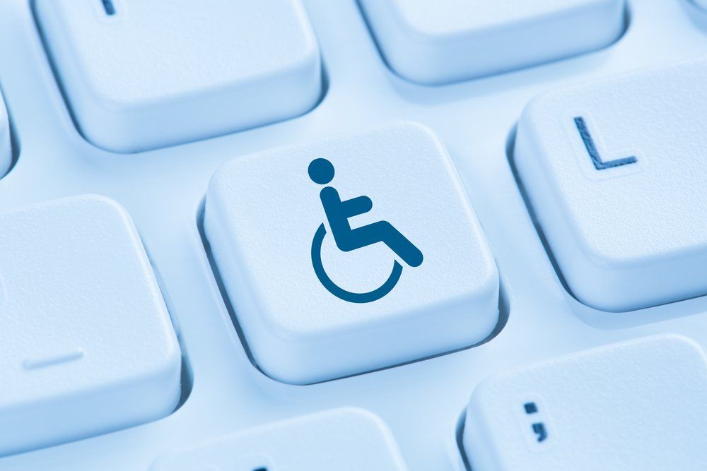
If there’s one feature about the internet that really makes it stand out, it’s the sheer amount of access it provides. But it turns out what we may take for granted as accessible isn’t always accessible to everyone.
When you first began putting your brand-new WordPress site together, accessibility may not be a consideration.
After all, how much accessibility does a site really need to be functional for most people?
The problem with this mindset, however, is it disregards the fundamentals of inclusivity.
Around 15% of the world’s population has disabilities, so everyone involved in the creation process will want to make sure their site is accessible to as many people as possible. It’s not just about the numbers, good PR, or better loading speeds. It’s simply that everyone should have access to the quality content that you provide.
Fortunately, WordPress has gone to great lengths to ensure plenty of tools are available to improve a site’s overall accessibility. In fact, there’s a dedicated team to doing just this. It’s up to the webmaster to engage with these tools and use them in a professional and presentable way.
To give you a helping hand, we’ll break down the ten most common WordPress accessibility problems and how to fix them.
Color Contrast
Any WordPress site will need to have adequate color contrast, and it’s a vital aspect to keep in mind when picking out a shade of colors for the layout of the site.
A significant number of people have trouble with elements of an interface, with bad color contrast and any text associated with that element. Text should stand out and be clear and easy to read. Paging through contrast combinations is highly recommended wherever possible before taking your site live.
Resizing Of Fonts
Your site will need to have adequate text font-resizing. Millions of users will want to have the ability to increase the overall size of the text to improve the readability of the information they’re trying to consume.
Elements containing text will need to be able to expand vertically to serve this purpose properly.
Media And Motion Control
It’s become a common theme among sites to have automated media play. This means that when a user loads up a page, any media present on it—such as GIFs or videos—will automatically start playing, often with audio included.
It’s recommended to allow the user to choose manually which media they would prefer to run, giving them a wider range of control. This also helps pages load faster and makes the site less resource-heavy for those using poor or unstable internet connections.
Text Alternatives
Most websites are very much media-rich. It’s easy for an impaired user to become overwhelmed with the abundance of visuals or audio they face, especially if they’re using accessibility tools.
Instead, you can make it common practice to implement “alt text” or alternative text, allowing the user to use text as an alternative to a decorative element that they may not be able to interact with properly.
Form Usage
Forms provide a way for users to input information into a site, whether it’s personal, financial, or even just a simple inquiry.
Ensure that any form plugins that you wish to implement on your site have a selection of accessibility tools available. It isn’t easy to find a plugin that meets these criteria, so it may be worth custom-coding your own form to meet your specific standards.
Form Time Outages
A common feature associated with forms is their ability to self-terminate after a preset period. The main reason for this, which applies to those forms that require financial input, is nothing more than a simple security feature.
Regardless, not every user can fill in a form within the given time. It’s well worth extending the time or giving the user adequate warning when the form is about to expire.
Descriptive Link Availability
Using links is how most users can jump around from page-to-page and site-to-site effectively. But a link may not be immediately clear to someone with poor vision or making use of a screen reader.
A hyperlink that simply says, “click here,” is not descriptive enough in terms of where it will take the user. The links need to be as self-evident as possible, allowing the user to have at least a general idea of where they’re going before they click.
Keyboard Navigation
Plenty of site visitors can only use their keyboards to get around efficiently. As part of your accessibility testing regime, it’s good practice to take the time and see how well your site plays with only keyboard interaction.
Take special note of easily the keyboard can give the user a special focus on an element they wish to check out.
Screen Reader Navigation
Talking about navigation, WordPress webmasters must consider functionality that caters to people using screen readers. This includes creating skip links at the tops of pages, HTML5 landmarks, and ARIA roles for improved section jumping.
Screen readers give the user the ability to navigate a site page by jumping from link-to-link – so having aria-label attributes and text for screen readers only goes a long way towards making your site accessible.
Markup Quality
When it comes to WordPress accessibility, HTML markup is a powerful tool.
Semantic markup, for example, allows the code to better describe the content that it consists of. Try to avoid repeating IDs on a page wherever you can and a linear usage of heading levels. Make sure that you always have an H1 and/or H2 before putting in an H3.
If you’ve read through this list and found that it may be too exhaustive to cover every aspect of accessibility, don’t fret. At Sunny HQ, we specialize in creating sites that are perfect for everyone. Regardless of the product or service you offer, we can help make it unique, vibrant, informational, and, of course, accessible. Chat with us for more information!


